
waterkind
SPEC CAMPAIGN
THIS IS A SPEC CAMPAIGN
Clean hydration with calm confidence, built for trust and clarity.
(Research)
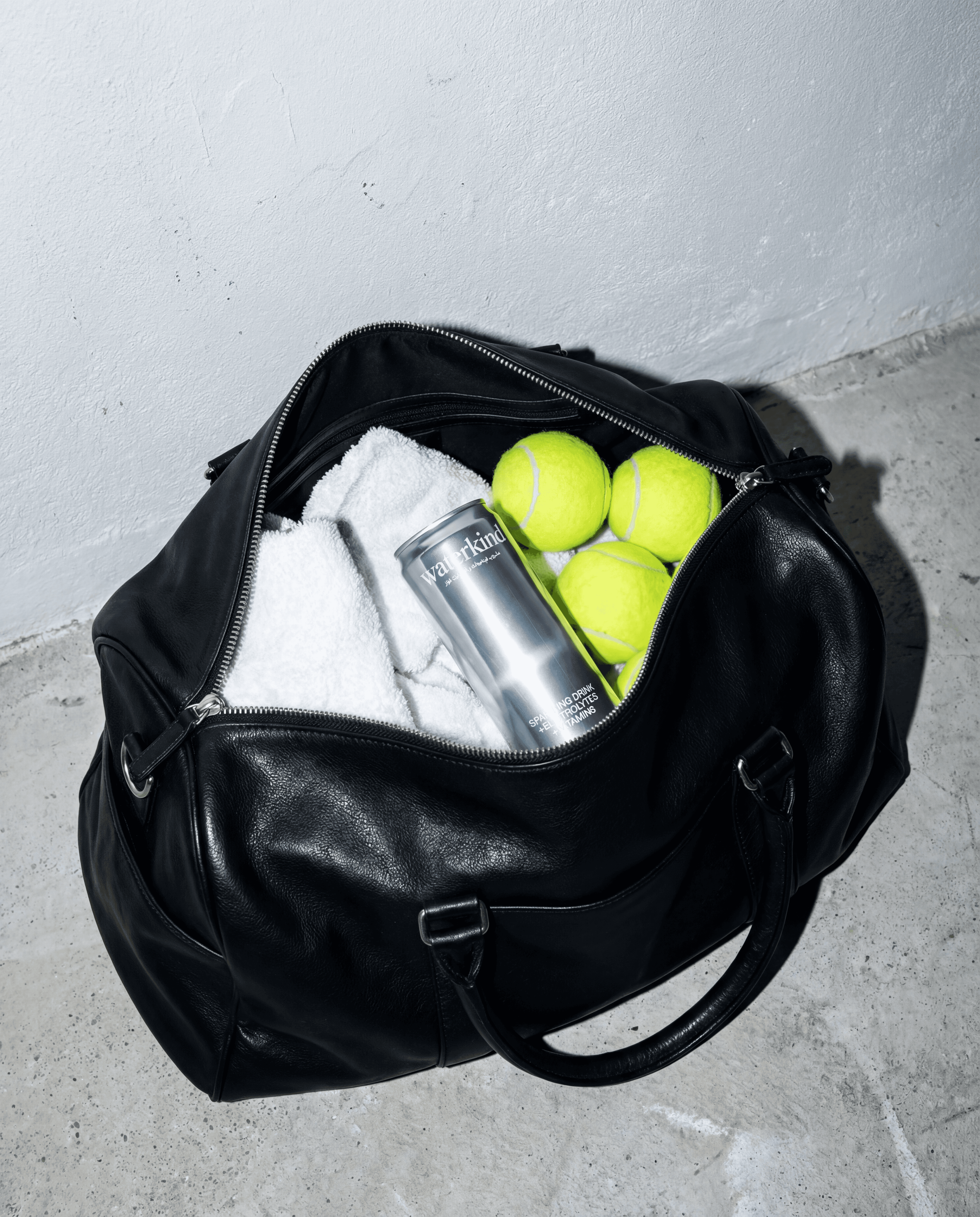
We mapped what makes “clean water” feel believable: restraint, provenance cues, and packaging clarity without sterile minimalism.
(Experiment)
Soft-structured identity: airy spacing, clean typography, and human-feeling imagery that stays minimal but warm and real.
(Results)
Scales across
social, web, OOH-ready layouts
Built for
clarity-first rollout and brand trust